
What does a designer think about contracts?

As a creative business owner and definitely not a lawyer…
This year I was lucky enough to join the team at Checklist Legal as their new Creative Projects and Design Manager. I have worked with Verity in the past as a supplier and client for my promotional and custom product business Promoloco. But until now I had no previous experience in the legal world.
To be honest, lawyers and contracts had always seemed quite daunting to me. My impression of lawyers was that they are well-read & educated, mostly male and intimidating.
When I became a business owner, that reaction only got worse as I was met with the imposter syndrome I felt as a relatively young woman in business.
“What if they think I’m stupid?”
“What if I’m doing something REALLY wrong and I just don’t know?”
I was a creative, clever woman who felt confident in most of her business but the legal side has always been something I needed help with.
And then there were contracts themselves… As a woman with ADHD and Dyslexia, let’s just say, traditional black and white contracts weren’t designed for me. Hard to read… TLDR… Boring…
My conditions don’t slow me down. I am a visual learner and lucky enough to live in an age when accessibility tools are better than they’ve ever been.
Spoiler Alert 🚨
You’ll hear a lot about accessibility from me
All of those thoughts and let’s face it… bias, were dispelled when I met Verity and her passion for contract design.
Verity is empathetic, easy to understand and rewriting the conversation for contract design and legal innovation. I had met her through One Roof, a community for women in business during lockdown in 2020 (I think it was Melbourne’s long winter lockdown… yikes what a time). I started working with her on my Promoloco contracts and then we met in person in December at an event. When you work with Verity as a client there are a lot of check-ins, video walkthroughs and opportunities to chat, so when I met her in person, it felt like I’d known her for years.
Confession 😬
Until I worked at a law firm, I was always under the assumption that contracts HAD to be slabs of text without any style. I thought, if these documents could have been reformatted to be easier to read and include a brand’s design elements… surely that would have been more common by now.
In reality, as long as all of the terms of the agreement and references are there, it can actually be designed however you like (with some exceptions).
What can you actually include in a contract?
Emojis
Icons
My favourite… “White” space (more on that below)
Modern fonts
Plain language
And even illustrations and comic strips to add dialogue
My legal design career is only just beginning but what I hope to see in the future for contracts is…
Accessibility
In my dream world, all contracts would include accessibility tools to make it easier for everyone to read or listen and understand contracts.
An example of this kind of technology coming onto the market is AccessiBe, which optimises the accessibility of your PDF and document files.
If your contract is directly on a website then a web-based accessibility tool like UserWay might be right for you.

Homepage of Checklist Legal with Userway menu in opened state.
Source: Checklistlegal.com
A simple cost effective way to make your legal documents more accessible is presenting them in a web browser. Web browsers like Google Chrome have accessibility tools like text to speech or colour contrasting that users can download themselves. If the user is reading documents online frequently, they will often have these tools already installed (like me!)
Plain language is also important, especially if your contract is going to be translated into other languages. In Australia we have such a culturally diverse population, making sure your contracts are simple enough for the public to understand is very important.
Videos
One of my favourite things about my Promoloco service terms is the overview section at the top of the agreement, that highlights all the main topics covered within the contract. What if this was presented in a video format? It would be pretty cool right?...
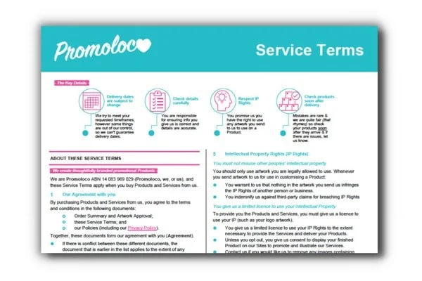
Promoloco service terms
Source: Promoloco
It might be overkill for some documents but watching a video overview before reading a contract on a website for example, could help the client understand and connect with the company they are about to do business with. Contracts can feel very disconnected to the rest of a brand. The language changes and the styling elements & fancy photos go away. This may leave the client feeling like they are in the wrong place or they’ve been tricked. Video is a great way to add brand consistency throughout the legal workflow.
A walkthrough video when handing over a new contract is an easy way to build a strong working relationship with your client, make it easy for them to understand and be confident using the legal documents moving forward.
I would like to see more videos in contracts to demonstrate examples of policies and terms in real life situations. You probably wouldn’t use this all the time, but for a Service Terms Agreement or as a part of the client on-boarding process, videos could be a helpful addition.
Interactive Contracts
Similar to the accessibility and video examples, I would love to see contracts become more interactive. Simple elements like when hovering your cursor over a “Legalese”, a short definition is displayed (helpful for us non-lawyer folk).
I’m hoping working with Checklist Legal will give me an insight into the legal industry and let me paint a new picture of what contracts look like to me - User-friendly, effortless to read & understand and dare I say… easy on the eyes.
If you want to chat more about contract design, branding and accessibility please come say hi to me on Linkedin 🤓
Need help designing your contracts with accessibility in mind? You can book a call with Verity and Bron below.
Bron’s Contract Design Checklist
✅ Add some “white” space
Don’t be tempted to cram all your information into one page. Space is a designer's best friend. Let that contract breathe!
✅ Give your contract a splash of colour
A pop of colour to a heading or reference link can make a big difference (Just be sure that it passes the Accessibility Contrast Checker Test)
✅ Add some personality with an avatar
A little out there I know, but if your legal document is long or a part of an onboarding process, it could help to add a friendly illustrated character to appear throughout the document with some definitions or references. Kind of like Clippy from MS Word in the late 90s but less creepy 👀
✅ Move your contract signing process into a browser
If your contract is going to be signed over the internet, adding it to a signing platform that uses an internet browser (like DocuSign, Dubsado, etc) will allow users to access their own browser extensions such as; Text to speech and other accessibility tools.
✅ Make it iconic by adding icons and Emojis
A picture says a thousand words… Adding an icon or emoji to your heading or to signal something important can be a quick way for the reader to know that they can jump to a section or find help easily while reading.
eg.💡 Example: [Insert example of a privacy policy term here]
✅ If you are going to use graphics like icons, be inclusive
You may have noticed that icons available for use in business documents are not very gender or culturally diverse. As designers and lawyers, we can make better choices.